
Business print
Choosing the right finish for your business cards
Compare uncoated, matte, gloss, soft-touch and specialty finishes by feel, durability, colour and real-world use.
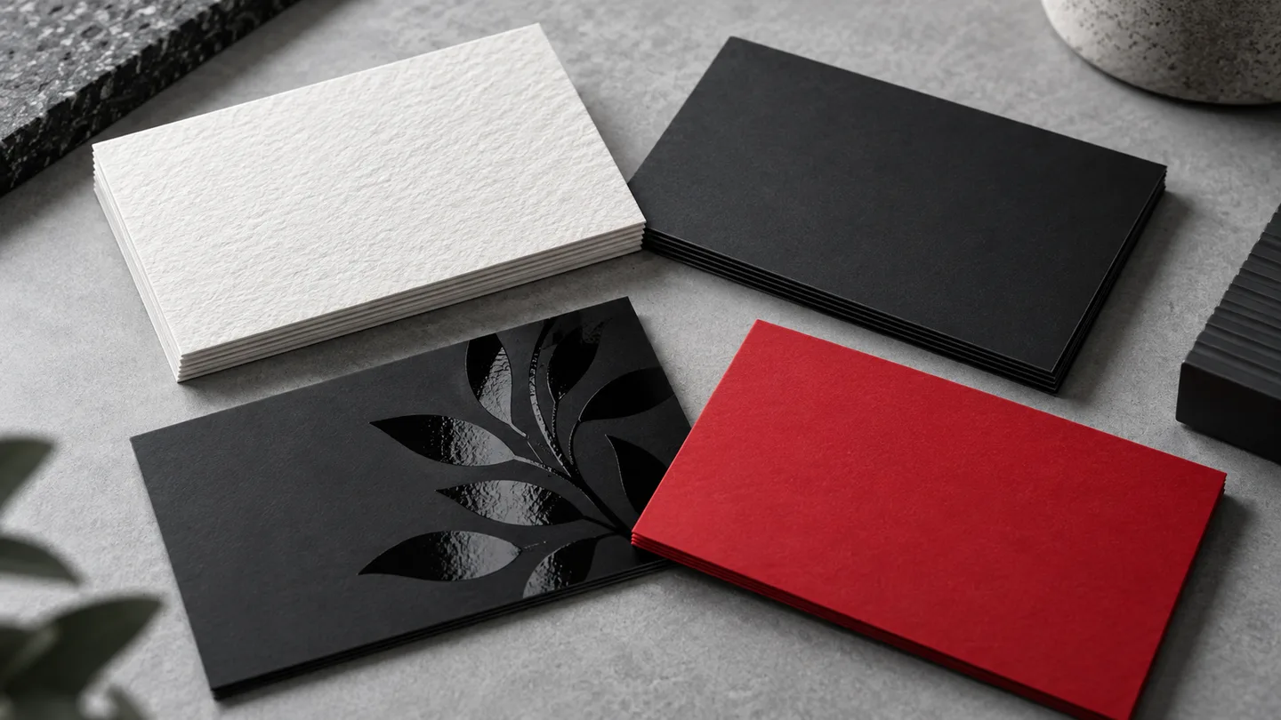
A business card finish changes more than appearance. It affects how colours reproduce, how the card feels, whether it can be written on and how well it survives wallets, counters and repeated handling.
Start with the moment in which the card will be used. A technician who writes appointment details needs a different surface from a luxury consultant whose card is designed to create a memorable first impression.
01
Begin with the stock, then choose the coating
Stock controls thickness, stiffness and base texture. Coating changes the surface. Two cards printed on similar stock can feel completely different after lamination or varnish.
- Uncoated: natural paper feel, low glare and easy to write on. Best for appointment cards, loyalty cards and understated brands.
- Matte or silk: smooth, refined and readable under most lighting. A dependable choice for professional services and general networking.
- Gloss or UV coating: stronger colour and shine, especially effective for photography, food and saturated artwork. Less suitable for writing.
- Soft-touch lamination: velvety, premium and substantial. Dark colours can show fingerprints, so test the design and handling conditions.
- Spot UV: glossy details over a matte surface. Use it selectively on a logo, pattern or key graphic so the contrast remains intentional.
02
Match the finish to the design
A finish cannot rescue weak artwork, but it can strengthen a clear visual idea. Uncoated paper softens colour slightly; gloss increases saturation; matte reduces reflections; spot effects depend on precise registration.
- Use generous contrast for small type and contact details.
- Avoid very thin spot-UV lines or tiny isolated coated areas.
- Expect dark solid backgrounds to reveal scuffs more readily than light designs.
- Keep essential text away from trim and rounded-corner areas.
03
Think about handling and distribution
Cards handed out at a trade show face constant handling. Cards placed inside premium packaging may need to look pristine only once. Cards used as appointment reminders must accept pen or pencil.
- Frequent handling: choose a durable coating and avoid delicate edge treatments.
- Writing required: leave at least one uncoated writing area.
- Mailing or packaging inserts: check finished thickness and folding or packing constraints.
- Large team orders: prioritize consistency, repeatability and easy reordering.
04
Use premium effects with restraint
Foil, raised effects, painted edges and specialty stocks can be excellent when they support the brand position. They also add production variables, cost and often turnaround time. One purposeful premium detail is usually stronger than several competing effects.
Business card decision checklist
- Where and how will the card be handed out?
- Does anyone need to write on it?
- Is the design photo-heavy, colour-heavy or type-led?
- Is glare a concern under office or event lighting?
- Will a premium finish support the brand or distract from it?
- Have the stock, coating, sides and turnaround been confirmed together?